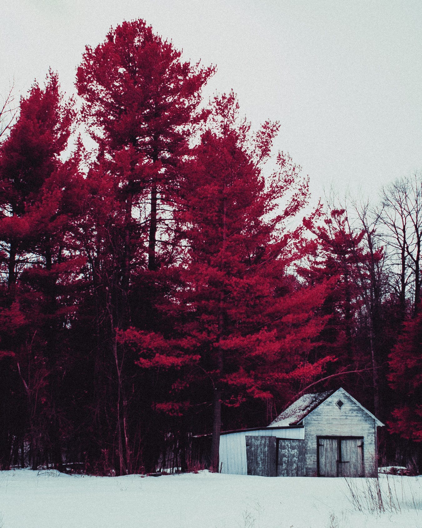
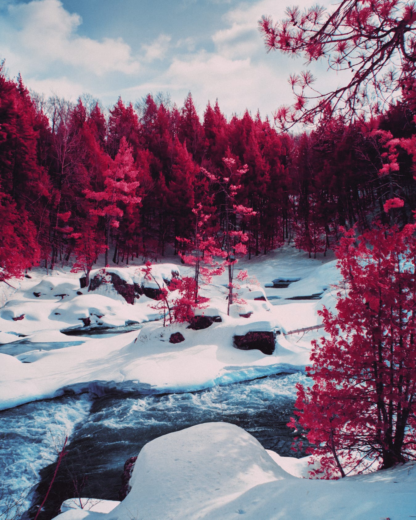
About a week ago I did another deep dive on Foveon sensors and infrared photography. This time around I encountered some forum posts I hadn’t seen before, where an individual mentioned that stacking a fluorescent light filter (FLD) with the Hoya Green (X1) rendered what looked like faithful Aerochrome look -straight out of camera. Fluorescent filters according to Brave’s search AI “..An FLD (Fluorescent Light Daylight) filter is a lens filter designed to correct the colour cast, often a greenish or bluish tint, produced by fluorescent lighting, allowing for more accurate and natural-looking colours in photographs”. Naturally, I had to try it for myself.
One struggle I have, using a nearly twenty year old digital camera for this project, is that the sensor performance is quite limited. I’m not speaking in regards to resolution but to low light performance and I don’t know how much of that is attributed to the limits of the Foveon sensor (or if I’m just accustomed to the performance of modern cameras) but in any case I’m pretty much locked into shooting at 100 ISO if I want any chance at “clean” images. So stacking another filter, a fairly dark filter at that, brought on another challenge; it’s a lot trickier to get a good Custom White Balance with this setup, especially in direct sunlight.
After several failed attempts, I did finally manage to register a Custom WB and I could see instantly how the foliage had a much nicer tone. It felt as if there was generally a lot less of a green colour cast. Although, even while looking at the back of the LCD, I could tell that I would still need to work the image a bit in post.
I was really hoping that this setup would allow me to drop my raw files straight into Lightroom and get going but after a few test shots, I quickly realized I wasn’t getting the colours and tones I was searching for. Aerochrome references (as I mentioned in my previous post) seem to be quite broad, I would go so far as to use the term “inconsistent”. Subsequently, a “great” Aerochrome simulation is quite subjective. I’ve seen some digital infrared photos that look really beautiful and that are obviously inspired by, or attempt to pay homage to Aerochrome’s cotton candy pinks, vibrant magentas, or crimson reds but at the end of the day, there doesn’t seem to be a solid foundation to base one’s work on. I would have loved to get my hands on some of Dean Bennici’s “fresh” rolls of the stuff but even his body of work varies from roll to roll. This could be a result of different filters or the fact that some of his stock was perfectly preserved while some of it was fogged or questionable, at best.

My hopes that the addition of the FLD filter would allow me to forego the Sigma Photo Pro software but (much like true Aerochrome) the colours I’m capturing seem to be inconsistent. For certain shots I managed to work directly off the .X3F in Lightroom. However some images render a better result if I continue to process them through Sigma Photo Pro first, where I give it a little “Auto” treatment. For anyone attempting to follow this recipe, I typically let the Sigma software do whatever it thinks is best to the exposure and WB (and yes, at this point, it may still look wayyy off the mark), then I export a .tiff and import it into Lightroom for some further adjustments. At this point, I often do another custom White Balance with the eye dropper tool, which lets me see what the Adobe software can do for me. But I often still need to adjust it manually to make sure I’m getting some nice, neutral whites, before I start playing with the hue/saturation/luminance sliders.

Since this is a new workflow with the FLD, none of the previous presets I saved for the X1 filter are working well. It’s like going back to square one. I had to build a new look (several, actually) from scratch and I’ll be honest, the images you’re seeing in this post took me a couple afternoons of tweaking and adjusting until I started finding settings that were in line with what I had in mind. I think the images from these past few days feel more like what I think a roll of Kodak Color Infrared Ektachrome would’ve looked like with a Tiffen Yellow #12 filter in it’s prime. Although, I haven’t shot the roll I have yet, so these edits are subjective and the product of my creation.
I tried to be true to Aerochrome. I’ve spent countless hours scouring Flickr, Google images, infrared forums and Instagram posts, trying to get a good understanding of what Aerochrome stock does under similar weather and lighting conditions before landing on these edits you see before you. One recurring theme I keep seeing on images of real Aerochrome, is a lack of dynamic range, a blueish or magenta cast to the whole image, often combined with some slightly muddied and faded shadows.
For now, I think this workflow is something I can get behind. I can’t say for certain that I won’t go back to my old one that consisted of only the Green (X1) filter because there were some images I took with that setup that I think rendered foliage with a wider variety of tones. At this point in time, I’m not quite seeing that variety in density with the addition of the FLD. However, I don’t know if that’s because it’s the middle of winter here and I’ve got a limited range of subjects with chlorophyll or if the FLD is cutting out too many waves of light in the spectrum. I’m sure someone with a better understanding of wavelengths would know exactly what’s happening and maybe tell me I should be using something else instead.
I already know that my next test may involve swapping the FLD for another filter. I’ve seen some mentions of combining the X1 with a Polarizer to try darken those blue skies in camera, as opposed to trying to do it in post (which, I tried to do but it looked so terrible that I didn’t save any of those edits!). I’ve also seen some posts mention a UV+IR Cut filter, a Tiffen Yellow #8, an orange filter, a red one…
I guess, I’m still chasing Aerochrome.


